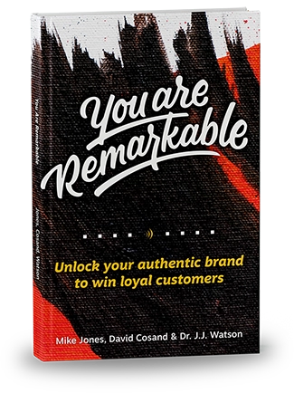
Download the PDF here and share with your friends: Conference Call Bingo So it’s you’re working from home. How hard can it be? You got this. Your kids are watching Frozen 2 (for the twelfth time today, but you don’t care, because those lovely savages are at least quiet). You’re looking totes profesh (at least Read More
A Website to Make Your Real Estate Brand Stand Out
At Resound, we try not to let our client blend in. At least, not in an area where they should be standing out. That’s because brands that have something special tend to make stronger connections with those people who will stay with them through thick and thin. In other words: “Brands that stand for something Read More
Resound Develops Website for Boston Consultancy
Connie Chandler, owner and principal at IR Strategies, and distinguished Investor Relations Strategist with over 20 years of experience in the industry found herself working from an outdated website that failed to show the breadth of professionalism and expertise that she offers her clients. Connie came to us with all of her material from her Read More
Five Steps to UX-Proof Your Website: Content Organization
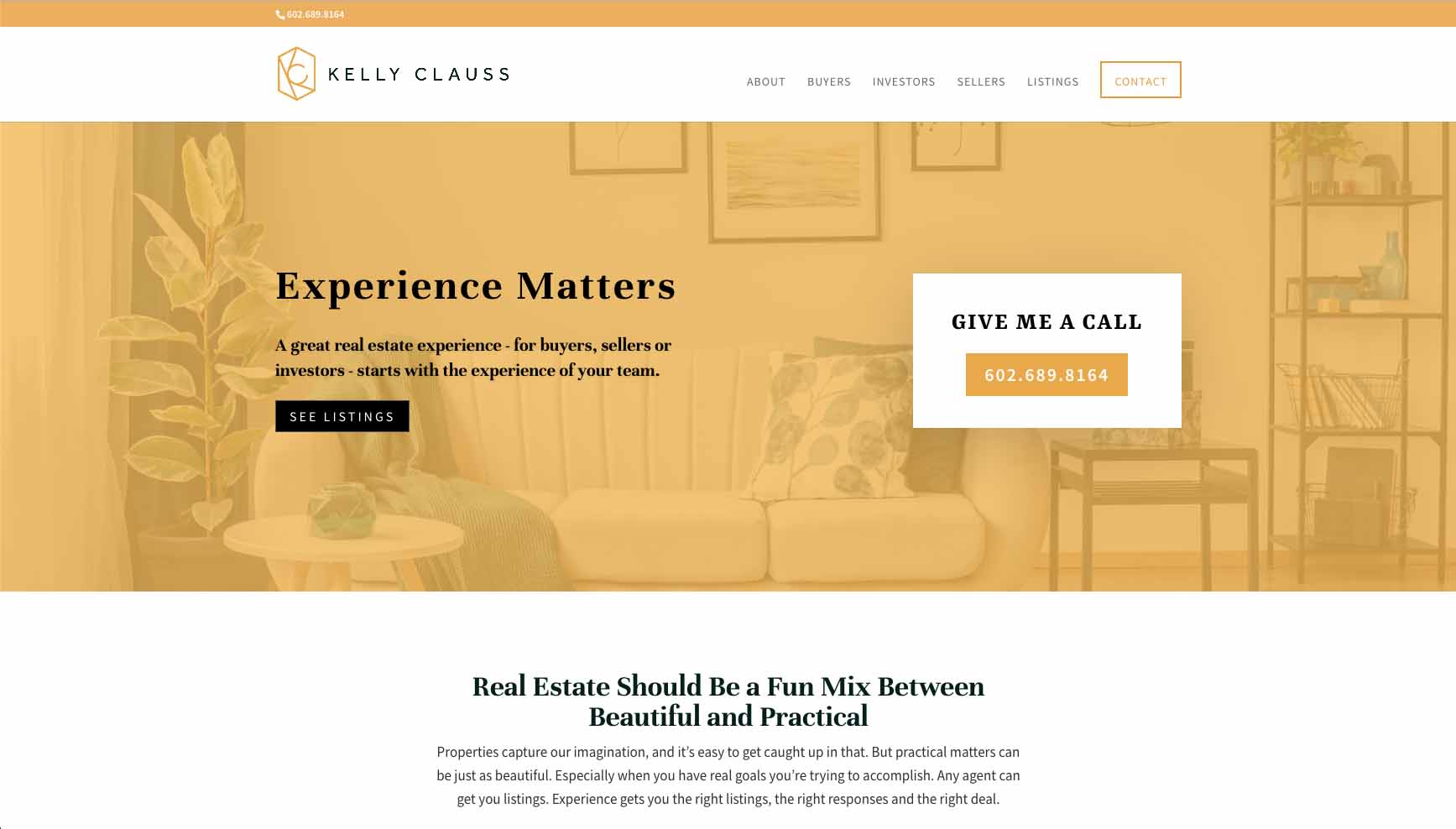
Well organized websites feel like your hometown: you generally know where you are in relation to what is around you. You don’t need to search for directions to find where you want to go. You just go. The key is to organize your website information architecture so intuitively that the user doesn’t even have to Read More
Five Steps to UX-Proof Your Website: Personas
Think about a product or service that has made an impression in your life. Maybe it’s an app or web service, or maybe it’s something like a kitchen tool. It’s something you reach for every day, and not just out of necessity. You don’t just use it passively, you genuinely enjoy the experience. This product Read More
Five Steps to UX-Proof Your Website: Part 1
Many companies mistake a slick, clean website for an effective website. In a culture that values outward appearance and presentation, we’ve lost sight of the fact that our websites are supposed to be used, and not looked at. Many homepages truly look more like modern art pieces than websites, and not in a good way. Read More
Color Speaks: Using the Right Colors in Your Branding
Think about the McDonald’s logo right now. What color is that M? Yup, it’s yellow. Or, gold, if you prefer. (Ya know…Golden Arches?) I’ll bet it took you .3684 seconds to come up with that answer. Why? Because McDonald’s has been very purposeful in their use of color over the years. When you’re driving down Read More
11 Web Design Don’ts for 2017
If your business is like most, your website is a huge part of your marketing and sales success. (81% of shoppers research online before buying. And that percentage increases to 94% when talking about B2B buyers!) Of course, if you’re selling products directly from your website, this is absolutely true. But even if you’re selling Read More
Method+Madness 2016 Recap
Every year, the folks at AIGA Arizona put on Phoenix Design Week – a week dedicated to the vibrant design community in Phoenix. The week typically kicks off with Method + Madness, a two-day design conference hosted in the heart of Downtown Phoenix. I attended both days of the conference, held down the fort at Read More
Unified Design: The Next Frontier in Branding
Someone once said, “Life is a journey, not a destination.” This quote doesn’t just apply to life. The same is true for your brand. Customers often go on a multi-screen journey with your brand as they move from device to device. You probably do it too. Have you ever used your iPhone to fill up Read More