Think about the McDonald’s logo right now.
What color is that M?
Yup, it’s yellow. Or, gold, if you prefer. (Ya know…Golden Arches?)
I’ll bet it took you .3684 seconds to come up with that answer. Why? Because McDonald’s has been very purposeful in their use of color over the years. When you’re driving down the road and you see that yellow M, there’s no doubt that a Big Mac and Coke are within reach (and if you’re hungry…they just bought themselves some business).
![]() Why do you think they chose gold/yellow? Could it be because yellow is very easily seen? How about because yellow denotes friendliness/happiness? With a tagline like I’m Lovin’ It, they’d certainly want to stay away from colors like sludge green and black, right? (P.S. Here’s a good visual on how colors could be generally perceived.)
Why do you think they chose gold/yellow? Could it be because yellow is very easily seen? How about because yellow denotes friendliness/happiness? With a tagline like I’m Lovin’ It, they’d certainly want to stay away from colors like sludge green and black, right? (P.S. Here’s a good visual on how colors could be generally perceived.)
What do your brand colors say about you? Have you put thought into the right visual message? If you haven’t, here are some baselines for palette-picking. (And no, “It’s your favorite color” isn’t on here.)
1. Pick colors that resonate with the core values and personality of your brand.
What do you really believe as a brand – what’s your purpose? And what’s the character of your brand? Is it a rebel, a queen, a doctor, a philosopher, or something else?
Let the answers to these questions inspire your selection of colors. If your used book store is all about helping people discover hidden literary gems (and your brand’s personality is more of the ‘philosopher’ type), then pick colors inspired by the cover of a beautiful book.
2. Do some research on your competitors’ color palettes.
Color can be a major key differentiator of your brand from your competitors. It’d be a huge bummer to invest a bunch of time and money in a color palette only to find out a competitor has a very similar color scheme. Spend a few hours researching and cataloguing your competitors’ color palettes and then use that research to inform the colors you pick for your own brand.
If you find an interesting color that none of your competitors are using, that might be a great place to build the foundation of your color palette.
3. Keep it simple.
It’s so easy to get lost in the color selection process and end up with way too many colors in your palette.
Trust me, this only means confusion for your customers if they can’t quickly recognize you by your colors. It’s also inefficient for your staff/agency when they create your assets (too many choices). We recommend keeping your palette to one or two primary colors and maybe a handful (3–5) secondary colors. Pick more than that, and you’ll be overwhelmed (and so will your customers).
Not Corporate…Family
Here’s an example of the difference color can make in a brand. We recently worked with local accounting firm Henry+Horne on a rebrand last year, and we developed a new color palette for them (among other things).
First, let us start out by saying that Henry+Horne strongly cares about their employees, their clients, and their community. And not in a corporate-y, “We care” kind of way, but in a we’ll-drive-your-tax-return-to-your-house-because-you-couldn’t-make-it-to-our-office kind of way. They treated us like family, because that’s just the way they do business.
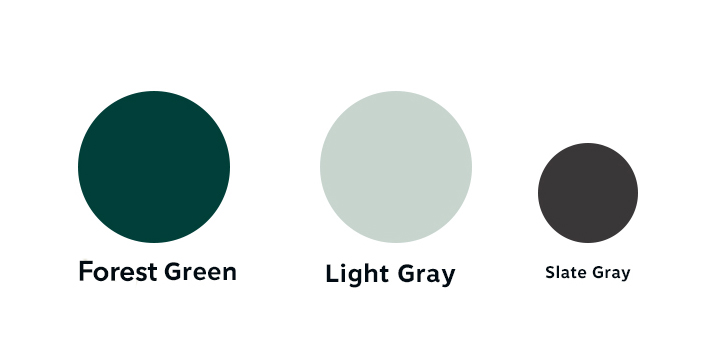 Now, their old color palette was an assortment of dark greens and grays. Does that say family to you? Does it say friendly, personable, and accommodating?
No.
It says established, cold, and accurate. It’s very corporate-feeling.
Now, while Henry+Horne is very established (they’ve been around for over 60 years), and accurate…there are better ways to communicate without sacrificing personality and authenticity.
We brightened their green up and gave them accent colors that bring a little life to the brand.
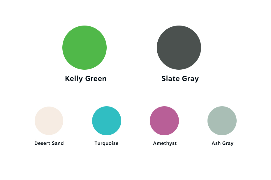
The primary color, a bright Kelly Green, represents happiness and is highly approachable. It commands attention, but by itself it could be slightly intense. Turquoise and Amethyst supplement as striking colors that connote “bright and fun.”
To see these colors in action, check out their website: hhcpa.com.
Much happier, right?
We sure thought so.
Sidenote: If you want to see the other stuff we created with Henry+Horne, check out our case study.
What are your brand colors? What was your process for picking them? Let us know in a comment below!