If your business is like most, your website is a huge part of your marketing and sales success. (81% of shoppers research online before buying. And that percentage increases to 94% when talking about B2B buyers!)
Of course, if you’re selling products directly from your website, this is absolutely true. But even if you’re selling services that require an in-person sale, your website can be one of your biggest marketing tools.
Knowing how important your website is, continually optimizing is your best chance to get more (and better) qualified leads and sales. Sometimes optimizing your website means just some tweaks here and there. And sometimes it demands a complete overhaul.
Either way – whether you’re making some tweaks or redesigning the whole website from scratch – here’s the first of 11 ways to royally mess it up.
By the way, we’re breaking this series of website project don’ts into three different articles – one post each for Design, Content, and Development. Be sure to check back over the coming weeks for the other lists…or sign up for our newsletter!)
1. Cramming everything into the navigation.
Oh man, is this a common pitfall! As you’re working through what pages should go on your website, it’s so easy to start thinking that every single one is equally important. Next thing you know, you have 20 links to pages in the main navigation at the top of your website. Now you’ve created a cacophony of competing choices for your website users. How overwhelming and confusing! And when we humans get confused we bail.
Here’s a before from Henry+Horne, our clients (the new site is cleaner, we promise).

There’s a few tips to make sure people can find what they need with your website navigation:
- Limit your top-level navigation links to only 3–5 choices and create sub-navigation with clear categorization. This might be a good opportunity to bring additional context to your sub-navigation items using micro-copy and images that are related to each item.
- Limit your navigation links, but include a prominent search form. If you have a lot of content and categories on your website this is a very elegant way for users to find what they’re looking for. And with the data you collect on what people are searching for you can optimize your future content development efforts to produce more of what people want!
- Use a mega menu hidden behind a single navigation link. I don’t recommend this for every business as it can become a lazy way to deal with bad content categorization. But if implemented correctly with clear and helpful categorization of sub-items, a mega menu can really help users focus on the main content of the landing page (while still giving them access to content you have to offer). This solution really lends itself to websites that have a ton of content and a very focused landing page strategy.
2. Ignoring accessibility best practices.
One of the most overlooked functions in website design is accessibility. This means designing and building your website in a way that is accessible to the largest number of people – including those with disabilities or impairments that constrain their ability to navigate and use a website like most of us take for granted.
Case in point: there’s a good likelihood that a percentage of your website visitors suffer from color blindness of some kind. Roughly 8 percent of males, and 0.5 percent of females, are unable to distinguish colors in some way or another, whether that be one color, a color combination, or another mutation.
Accessibility best practices would lead you to design your website so that colors are used appropriately for these users (for example, using blue for links and other calls to action as it’s one of the most distinguishable colors for those with a red color blindness – the most common type). It also would lead you to design links and calls-to-action with some other visual signifier other than color – like an underline or icon. We realize we are the pot calling the kettle black here…and we’re making these changes in designs for our new site (coming soon to a browser near you).
Accessibility best practices will also guide the way your website is built – how the code is created and structured. Some physically impaired people will use screen readers to scan and navigate your website and the way the HTML is structured on each page will determine how easily they can do this.
For a much deeper dive into accessibility and best practices, I recommend these resources:
- The World Wide Web Consortium (W3C) standards for web design accessibility
- This article on creating accessible websites from the American Foundation for the Blind
- Website accessibility evaluation tools (as collated by the W3C)
3. Making Nothing a Big Orange Button
This is the real-world equivalent of never asking for the sale. If you don’t make it clear to the user what the intended next step is for each page, you are simultaneously not helping them and hurting your business.
People have never been busier or had more demands on their time in the history of the human race. Our brains are really good at figuring out when something is going to cost energy and calories. If the value isn’t clear, our brains check out and move us on to the next thing.
When you are not clear about what you would like someone to do next (with a clear call-to-action) you are making them think – the mental energy equivalent to friction. And this creates more work for your users…which usually leads to them checking out and moving on to some other activity.
On your website, this doesn’t mean every page needs to have a giant button to make the final sale: that might not be appropriate for where the user is at in the customer journey. But it certainly means that every page should have a goal and then a call-to-action that matches that goal. That may be discovering more content related to what they’re reading, or downloading a resource (in exchange for an email address), or yes, making the purchase.
I’ll go ahead and drink my own Kool-aid right now: want help redesigning your website? Contact me.
4. Or, Making Everything a Big Orange Button
Okay, so you’ve got calls-to-action on your pages – fantastic! But wait a second, are they all big and the same bright, bold color? So are you saying they’re really all of the same importance, urgency, and even have the same result?
When you make all the calls to action on a page the same, you’re confusing your users. They won’t know which is really the most important. And it will appear that they are all of equal value (both to them and for you and your business). On top of this, by making them appear all the same, someone in a hurry who isn’t detail-oriented might assume they all go to the same next-step and could quickly get lost and frustrated.
Best practice: put only one really important, urgent call-to-action button on each page. This doesn’t mean there can’t be other links or other buttons, but they should not carry equal value in the way they are displayed. Help people focus on what’s really important to do next and minimize the number of choices.
5. Siloing Your Writers, Developers, and Designers
This goes for nearly any creative endeavor, but especially with websites. If you don’t allow the various people creating your website to collaborate and provide feedback to each other in the process, you’ll not only end up with a confusing experience for your users, but you’ll find your team doing a lot of rework…and they’ll be incredibly frustrated by the end of the project.
As you’re thinking about the team who will help you build your new website, consider the processes and tools they’ll need to collaborate well together. When the team can gel, you’ll end up with a far better end result.
6. Forgetting About the Favicon
What’s a favicon, you say? A favicon is the little icon that you see in each of your tabs on your web browser when you’re on different websites:

This icon is a fantastic way to not only keep your brand front-and-center for your website users, but also help them easily navigate back to your website when they’ve got lots of tabs open in the web browser. If you don’t add a custom favicon, you might find that your website hosting service or another service that you’re using will add their own logo as the favicon. And this could be quite confusing to your website users.
And while you’re adding a favicon, be sure create some other icons that Apple and Google and other services use to display your website as an app icon if users save it on their smartphone.
Here’s some great technical info on how to create a favicon for your website: http://www.creativebloq.com/illustrator/create-perfect-favicon-12112760
7. Featuring Overused, Staged, or Irrelevant Stock Photos
In a perfect world everyone would use their own professionally-shot, totally custom photos for their website. But we fully recognize that not everyone can afford that level of quality. In a pinch, stock photos can be a decent alternative but there’s a lot than can quickly go wrong.
- Over-used stock photos: while there’s literally millions of stock images
 to pick from, many businesses end up using the same couple hundred. If you find yourself in this boat, you could be setting up your website users for confusion as they’ll likely have seen the same images on other websites and ad campaigns. They may even have seen that same image used by one of your competitors! Before you pick images, do a little homework. Check out what competitors are using. Dig a little further when searching images on stock photo sites – don’t just pick the first image you like as it’s likely to have been used by a lot of other businesses. And run your final selections through a reverse-image search on Google to see what other businesses use them.
- Staged stock photos: this is especially applicable to stock photos
 that have models in them. There’s a pretty wide range of quality in the stock photo space. Some are both professionally shot as well as creative and engaging. But a lot are flat and the models look totally staged and faking it.This is where getting professional, custom photos shot for your business – with real customers and employees can bring true authenticity to your website. But if budgets are tight, take a little extra time to evaluate the images in your stock photo search and look for shots that have a more journalistic look and feel closer to the reality that your customers will experience with your business. The world does not need another website with a fake-smile, business-man-on-the-phone image on it.
- Irrelevant stock photos: Does your company sell co
 oking spices to chefs? Than you better not have stock photos of kids running around at the beach. That’s completely out of context. Consider what your customers expect to learn or feel about your products and services and find images that convey those truths. In the example I just gave of the spice company, I’d expect to see images of the actual spices, fully prepared meals, chefs cooking in their restaurant, and happy, satisfied diners.
8. Overwhelming Your Website Users
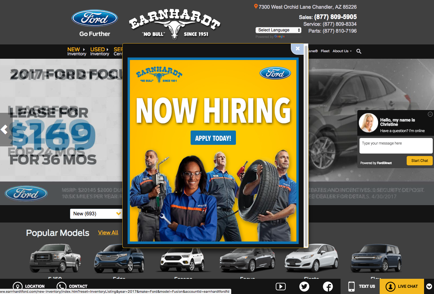
Don’t you just love when you’re on a website and a big newsletter sign-up form pops up, and then a live-chat thing slides in, and the navigation menu takes up half the page? Yeah, we didn’t think so.
Overloading your website experience on small (or…let’s be honest…all) screens with excessive flash banners, newsletter signups, and huge navigation banners leaves people with a frustratingly small amount of usable reading/viewing space.
While it can be nice from the business-standpoint to get more newsletter sign-ups and chats from customers, if they’re just doing it out of frustration we’re ultimately sacrificing their experience for a short-term gain. It will come to bite us in the butt as they’re less likely to come back and find the website useful. And we’re leaving them with a sour taste in their mouth.
If you want to delight your website users so they keep coming back (and gain a positive perception of your organization) don’t overload them. Be tasteful with your use of popup and slide-in elements. Only use them at the points in the customer journey when they actually really want them.
For example, it may make sense to only use the pop-up newsletter sign-up form after someone has been to your blog multiple times and has viewed a few different posts in a row. This is a good sign that your content is highly engaging to them and they’d probably like to get more of it delivered directly to their email inbox.
Keep your customers’ experience as the priority and you’ll likely end up with a great website (for both them and your business).
9. Making it Difficult to Get in Touch
Every business is different when it comes to how direct contact with customers plays into their business model and customer journey. For some it’s an integral aspect of the sale. For others it’s primarily to handle customer service or support requests.
Either way, make it easy for customers to get in touch. And in different ways. Make sure you have your phone numbers, email addresses, and contact forms easy to find and accessible.
You may not need to have your phone number in 30 point font at the top of every page but if it’s buried at the bottom of a Contact page that isn’t accessible through your navigation menu, you’re probably missing out on some great opportunities to serve and delight your customers. And that could mean lost loyalty, referrals, and ultimately revenue.
10. Featuring “Walls” of Text Unbroken by Headers or Bullet Points
Unless your website is actually a literary novel, it’s best to format your content so that people can easily scan and read it quickly.
Here’s some quick ideas to make your content more readable (See what I did there?):
- Add sub-headers to your sections of content to provide easy context.
- Reformat lists in paragraphs into bulleted or numbered lists so users can easily identify them and peruse them.
- Are you using a quote from some other source? Give it some additional styling so it’s easier to identify as someone else’s words (and hopefully what they are saying – as a 3rd-party expert or customer – reinforces what you’re saying).
- Add images, charts, or graphs to give context to your words.
11. Being Afraid to Try Something New
A new website is a fantastic time to rethink how to deliver a delightful and helpful experience for your customers. While it’s good to see what others are doing with their websites that will bring value to yours, it can be even more impactful to create a website experience that’s unique to your business and your particular audience. Doing something new and highly valuable for your customers can be a real differentiator and provide more opportunities for them to talk about you and get you more referrals.
Thinking about doing something new or different with your website?
A good place to start is with customer surveys and interviews. Get as much information about what your customers want out of your website and the context in which they are using it. And then use this data to inspire you and your website team to create something truly unique and valuable for your customers.
Be sure to stick around for the next two parts in this series of website design no-no’s. Next up: content & writing no-no’s for your website redesign. And then we’ll cap off the series with a list of development & technical no-no’s for your website redesign.
Hopefully these tips inspire you with your website redesign. If you end up using any of these tips to make your website better, please let us know! Drop us a line in the comments or contact us directly.