Henry+Horne Rebrand
We executed a three-step brand development initiative for Henry and Horne that ended with some really sweet results for the firm
“Working with Resound on the firm rebrand was a great experience. They didn’t just want to give us a pretty logo, they wanted to understand the firm, industry and the perception the firm has with our clients, the community and our team members. Resound made the whole process, from the brand audit through the launch, run very smoothly. Their team is creative and professional. I am very excited with the final product we received from Resound."
Identity Crisis
Henry+Horne has been providing stellar financial services to the Phoenix area since taxes were done on ledgers and carbon paper – over 60 years ago. In 2015, they approached us with a problem: their brand image hadn’t kept up with the changing times. Neither had their website.
Plus, they were losing their title as Arizona’s largest, locally-owned CPA firm. And what do you do when your brand's position in the industry is slipping away?
You call Resound, naturally.
And that’s just what Henry+Horne’s Director of Marketing did! After finding our blog and our take on the importance of branding, she heard us speaking her language and mirroring the values of Henry+Horne. It was the perfect fit. We executed the Henry+Horne rebrand initiative that ended with some really sweet results for the firm.
Brand Audit
From the get-go, it was clear that Henry+Horne wanted to refresh their outward-facing image (including their website) to root their brand and better connect with customers. They also hoped to increase conversion rates on their website. Who doesn’t?
So we got to work.
We dug deep into Henry+Horne’s soul. We started by conducting a full audit of their branding (including client/employee interviews). This gave us some amazing insights into Henry+Horne’s rich history, clients, and team. Henry+Horne puts full priority on the people they serve, going above and beyond to make sure everyone’s taken care of.
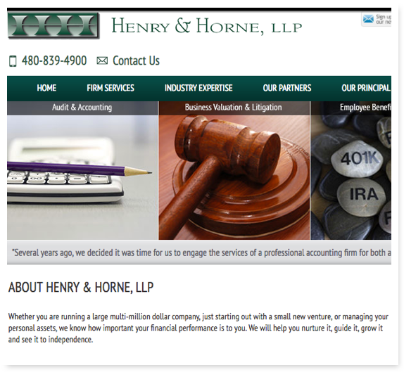
The color scheme was comprised of dark greens and greys. The logo mark was aggressive, clunky, and not very inviting. Their brand voice was professional – but in a scientific, sterile way. The content on hhcpa.com was overwhelming and confusing to users. We had to find a way to convey both the breadth and depth of Henry+Horne’s expertise to their audience – without completely losing their personality!
Brand Workshop
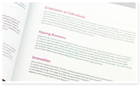
We started by defining Henry+Horne’s brand values, personality traits, and verbal guidelines. Uniquely, for an accounting firm, Henry+Horne’s values revolve around relationships, trust, steadiness, smarts, responsiveness, and confidence. Since Henry+Horne could no longer own the title of “largest locally-owned CPA firm in Arizona”, it made sense for us to work with them on a new tagline – a verbal differentiator that reflected their people-centered values and industry-specific expertise areas. The new tagline, “Offering You More”, puts the client front-and-center.
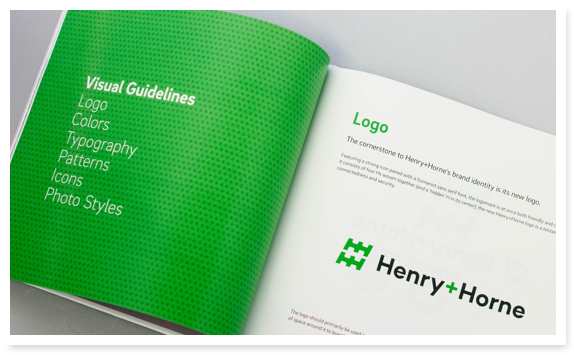
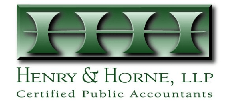

Tackling Henry+Horne’s logo was next.
Now, logos are always a big deal, but Henry+Horne’s logo needed to be the perfect anchor for any and all new visuals. It had to speak to the personality and values of the brand. After developing and refining a few different ideas, we landed on a strong new mark of four H’s woven together (and a ‘hidden’ H in the center – can you see it?). We selected a humanist sans serif font to give a friendly and professional appearance.
Historically, the “and” in “Henry and Horne” was marked with an ampersand - “&”. We suggested a plus sign instead – a no-brainer for an accounting firm!
Colors, Fonts & Patterns
Their new primary color, a bright Kelly Green, is happy and highly approachable. The complimentary colors, turquoise and amethyst, connote a “bright and fun” appearance. We thought it was solid. The firm agreed.
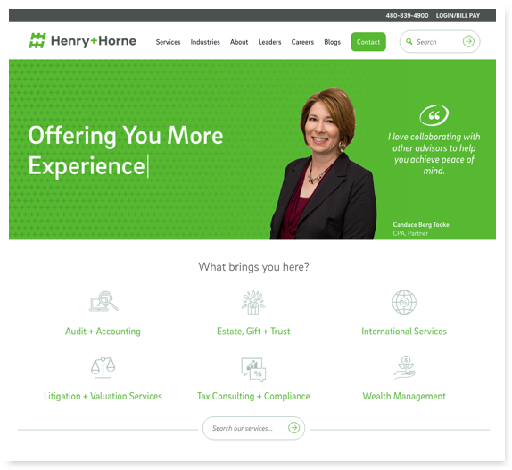

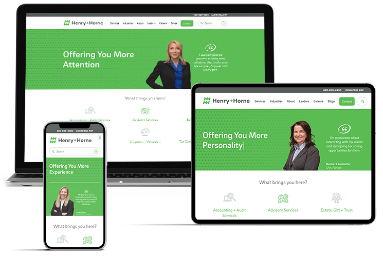
A New Site for a New Era
Henry+Horne has been providing stellar financial services to the Phoenix area since taxes were done on ledgers and carbon paper – over 60 years ago. They approached us with a problem: their website wasn’t converting and they hadn’t kept up with the latest design trends. It lacked a purposeful user flow and featured way more content than was helpful for the average user.
After finding our blog and checking out our thoughts on how brand plays into the shiny stuff like design and websites, Henry+Horne’s Director of Marketing got with us to infuse their recent rebrand into a game-changing website.
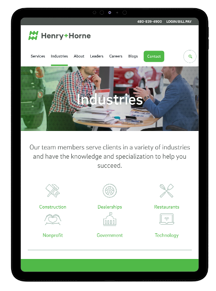
Content Strategy
Since we worked with Henry+Horne on their rebrand, we had a great relationship with their marketing team and worked closely with them to maximize the amount of on-brand, relational content on the new site.
Henry+Horne had their own copywriter on staff, so our content team walked Henry+Horne through the right copy for their pages, mentoring them on their new writing style (from the rebrand we completed prior to the website project). We also helped their team write more concisely – creating only the information that users really needed.
Plus, we made nearly all the content editable from a development perspective for the Henry+Horne team to directly manage and add to in the future.

Web Design & Development
Structurally, we brought Henry+Horne’s six separate blogs together on WordPress with the rest of the site and upgraded the mobile experience, taking it from a very simple contact page to the full site. This allowed greater accessibility for users and greater discoverability through search engines.
From a technical perspective, there were a few challenges with the complex design and the random generation on the home page. Making dynamic content like quotes and pictures line up correctly in a responsive environment isn’t easy, but our developers tackled it with style.
Everyone on the Resound team – designers, copywriters, and developers – walked Henry+Horne through the right copy for their pages, mentoring them on their new writing style: considerate, knowledgeable, and human. They also had help writing more concisely – creating only the information that users really need.
Our designers used icons to quickly communicate and reinforce ideas, driving more engagement than simple lines of text. These icons were developed as vectors, however, increasing site speeds (as they’re easily responsive).
On the whole, the new site reinforces the idea of “family” and brings out the firm’s uniqueness when compared to others in their industry.
Plus, we made nearly all the content editable for the Henry+Horne team to directly manage and add to in the future.

Results
The moment of truth came with the official reboot of the new Henry+Horne website.
1,200+
Sessions in the first three days of launch
23%
Increase in
pages viewed
20%
Increase in users' average time on the website
620%
Increase in visits to the "Services" page
600%
Increase in visits to the "Leadership" page
A Fresh Restart
With the launch of the Henry+Horne rebrand, would people buy in? We knew from our close work with the firm that the internal team felt good about having their voice heard in the rebranding process. In business, though, everyone wants to see a result they can see, touch, and feel.
Did we pull it off?
Well, Henry+Horne received the 2016 Arizona’s Most Admired Companies Award (based on leadership contribution and employee, customer and community opinions) and was named a Best of the Best Firm, moving up 13 spots on the list of Top 200 Firms by Inside Public Accounting.
They also won four AAM awards, including best rebrand and best website.

Your content goes here. Edit or remove this text inline or in the module Content settings. You can also style every aspect of this content in the module Design settings and even apply custom CSS to this text in the module Advanced settings.