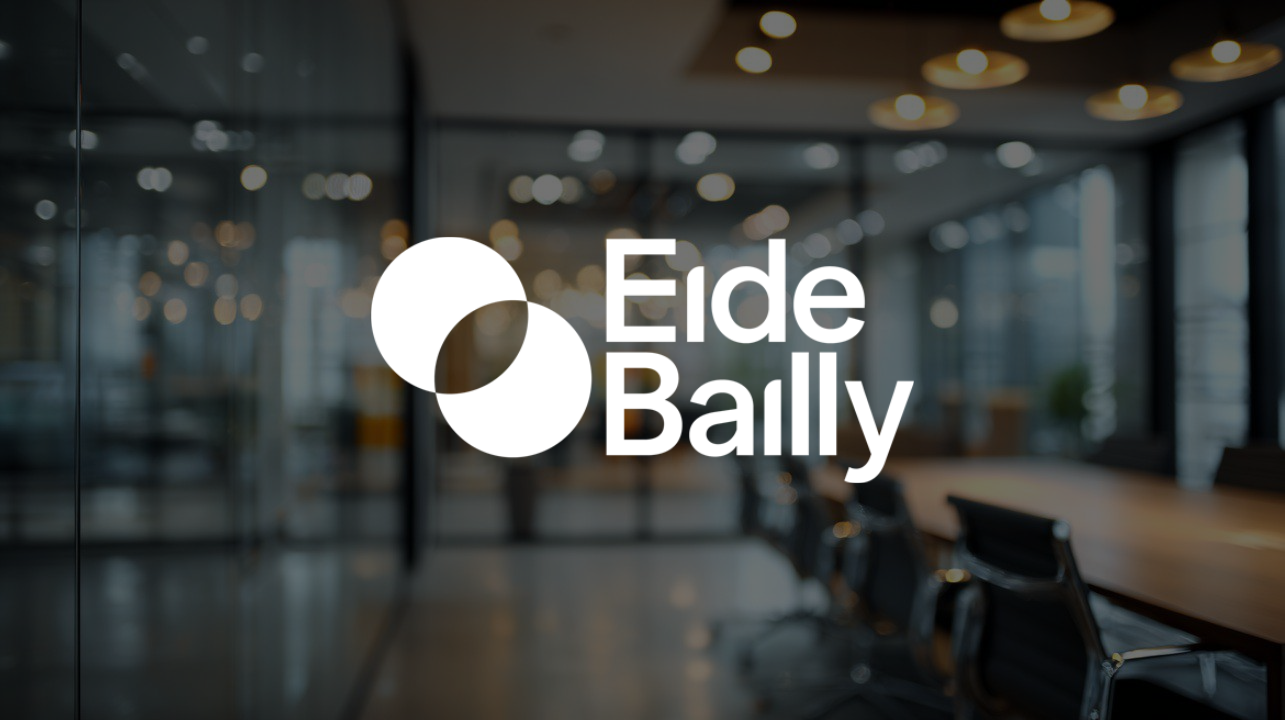
In true market leader form, Eide Bailly completed the biggest accounting firm rebrand of 2025. New logo. New colors. New brand intro video. I am certain they invested substantial coinage to refresh their presentation, and they made an effort to inject meaning into their new logo mark. They tethered it to “real connection” and “genuine relationships.” They even found a clever design rationale by pulling the dots from the two “i’s” in “Eide Bailly” and overlapping them.
The problem is they approached the process from the wrong direction.
Instead of discovering what makes Eide Bailly remarkable and letting that authentic identity guide their visual expression, it looks like they started with the cosmetics and tried to attach meaning to them afterward. The result shows what happens when firms skip the reflection step of brand discovery and jump straight to expression.
If your firm is planning a 2026 rebrand, the Eide Bailly rebrand offers valuable brand strategy lessons about what works, what doesn’t, and how to tell the difference.
Brand Strategy Principle #1: Work Inside-Out, Not Outside-In
Effective brand strategy always works from the inside out. You start with the authentic core of who you are and what makes you different. Then that meaning drives everything outward: your visual identity, your messaging, your client experience. In our book “You Are Remarkable,” we describe this process: “Every visual choice you make should be grounded in your brand’s authentic identity. This should be obvious with the big things: your logo and color palette must reflect your brand.” (Chapter 10)
When you reverse this process and work outside-in, you start with visuals or design concepts and then try to justify them with meaning. The symbolism feels retrofit rather than authentic. The messaging sounds like it’s explaining a logo rather than expressing something true about your organization.
How this shows up in the Eide Bailly rebrand: They started with a visual concept (overlapping circles representing connection) and then attached meaning to it. They talk about “real impact starts with real connection” and then emphasize “great relationships don’t happen by chance.” These are great sentiments, but they feel vague… like after-thoughts used to defend the logo mark rather than expressing something distinctly true about Eide Bailly.
The challenge becomes clear when you ask: What about overlapping circles specifically captures Eide Bailly’s unique approach to connection? How is their way of building relationships different from every other professional services firm claiming they care about clients? The overlapping circles symbolism is generic enough to work for anyone, which means it doesn’t really work for Eide Bailly.
Brand Strategy Principle #2: Distinctive > Simple
Simplicity in logo design is valuable. Many firms, because they’ve not labored to define the one thing that sets them apart, toss a bunch of loosely connected ideas and symbols into their logo design “pot”. The result, like most stews, is a bowl of complicated, unappealing ingredients floating in a sea of enigmatic liquid.
But that doesn’t mean the goal is simple. Simplicity without distinctiveness creates a different problem. When your logo and your visual presentation could belong to anyone, it doesn’t really belong to you.
Your visual expression needs to be both simplified and distinctive. Professional services branding requires finding that balance: something clean and professional that’s also unmistakably yours. Think of Baker Tilly’s logo with its interesting, unique shapes. Or Nike’s swoosh… elementally simple but unmistakably theirs. Both brands started with clear identity and let that drive distinctive visual expression.
How this shows up in the Eide Bailly rebrand: The overlapping circles logo faces serious differentiation challenges. Rotate it 45 degrees and you have the MasterCard logo. A quick web search turned up the Fighting Blindness Institute in Ireland using the exact same mark, just tilted differently. Search “overlapping circle logo” on design sites like Dribbble and you’ll find this as a default option alongside dozens of similar concepts.
At Eide Bailly’s scale (thousands of employees, presence across multiple states) this lack of distinction is a missed opportunity. At some point in the process, someone probably said “good enough” when they should have said “too obvious, too common: back to the drawing board.”
Brand Strategy Principle #3: Internalize and Express Your Brand Everywhere
Even if you settle on a simple, potentially common logo, you can still make it yours through consistent, creative application. A logo is just the beginning. The real rebrand magic happens when you take that visual identity and weave it throughout everything: your website, your videos, your client communications, your walls, your elevators… any place you or others encounter your brand.
When you truly own a brand design platform, people see your mark used in interesting ways that reinforce your story and build recognition. Each touchpoint becomes another opportunity to make your identity memorable (and meaningful). Compare how Eventbrite handled their 2024 rebrand… their new logo mark appears throughout their website in different, engaging ways. It’s woven into the visual system. It reinforces their story repeatedly.
How this shows up in the Eide Bailly rebrand: Their brand introduction video shows individual dots for 38 seconds before briefly showing the overlapping circles for about 5 seconds. Then the motif disappears until the final logo card. Their website barely incorporates the circles beyond the logo placement. There are some rounded edges and a few circles present in the design, but it doesn’t feel like a cohesive narrative that should invest the logo with meaning.
When you invest in a rebrand but don’t follow through with consistent application, you signal something about your organization. It suggests that the firm doesn’t really know who they are and what makes them remarkable. It implies you’re not quite sure what you want your brand to mean… and that lack of clarity drains client confidence.
Lessons for Your 2026 Rebrand
These three brand strategy principles (working inside-out, prioritizing distinctiveness, and internalize and express your brand everywhere) point to a deeper challenge we see frequently in professional services: organizational impostor syndrome. In “You Are Remarkable,” we explain it this way: “For individuals, imposter syndrome is an eerie feeling of inadequacy around your equally successful peers, as your own success must rest on some mistake, stroke of luck, or fraud. Organizations can suffer from the same difficulty.” (Chapter 5)
When firms don’t know what makes them remarkable, they look around at successful competitors and try to copy the approach. They adopt the visual language they think accounting firms are supposed to use. They talk about connection and relationships because that’s what professional services firms say. They create branding that’s more about meeting category expectations than giving clients an authentic, compelling reason to choose your firm.
This shows up in conservative color choices (dark blue is exceptionally common in the industry). It appears in similar geometric logo shapes across firms. It manifests in generic messaging about partnership and trust and expertise. None of it is wrong. It’s just not distinctive. And when you’re not distinctive, you’re forgettable.
Questions to Consider Before Rebranding
If your firm is planning a 2026 rebrand, you’re probably facing one of several situations: recovering from a merger, responding to leadership changes, or expanding into new markets. Before you invest significant resources, use this checklist to determine if you’re truly ready:
Has your fundamental identity actually changed? Most changes (new partners, new offices, new service lines) require evolution, not revolution. Genuine rebranding makes sense when your purpose and values have fundamentally shifted, such as with ownership changes or dramatic strategic pivots.
Are you prepared to do the discovery work? Real brand strategy starts with honest examination of your authentic identity, values, and the specific trade-offs you make that others wouldn’t. If your partners want a new logo by Q2 but won’t invest in this discovery process, you’re setting up for superficial branding.
Can you articulate what makes you different in ways that aren’t easily copied? Generic claims like “we care about clients” or “we provide excellent service” aren’t differentiating. If you can’t articulate your distinctiveness now, a 2026 rebrand won’t create it: All you’ll get are new cosmetics that try (and fail) to spruce up what is essentially a commodity.
Are you willing to be distinctive, even if it feels risky? True brand strategy requires courage to look different, sound different, and make different promises than competitors. If your leadership defaults to safe choices that fit category conventions, your rebrand will be forgettable.
Do you have the commitment to implement consistently? A logo is just the beginning. Effective brand strategy requires following through across every touchpoint. Half-measures create confusion (or, worse, cynicism) and waste your investment.
Are You Planning to Rebrand?
Every firm that tackles a 2026 rebrand will face similar challenges and decisions. The principles we’ve explored (work inside-out, prioritize distinctiveness, and internalize and express your brand everywhere) provide a framework to guide your brand strategy work. The questions in our checklist help you determine if you’re truly ready to invest in the discovery process that makes rebranding meaningful.
Here’s what we know for certain: your firm is truly remarkable. You have unique experience, perspective, and values that cannot be duplicated. You serve clients in ways that matter. You make trade-offs and decisions that express your authentic identity. Maybe your 2026 rebrand will be the year everyone else finds out how remarkable you really are.


