
The Department Rebrand
We worked with The Department to execute a rebrand worthy of their downtown-Phoenix entrepreneurial ecosystem.
"Resound came in and defined what seemed like an undefinable business and brand. We had decades of history built into our business and a unique geography that Mike and his team not only unearthed but highlighted and connected with all they put together for us."
A Modern Business Dilemma
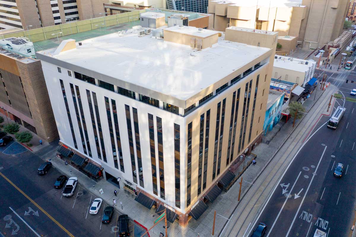
When you’re an entrepreneurial ecosystem with multiple service offerings based in an old department store in downtown Phoenix, you’ve got a lot of decisions to make when it comes to your branding. When a huge part of your marketing revolves around your booming coworking space (which are like, so hot right now), things get even more complicated.
The Department (a coworking space in Downtown Phoenix) approached us to do a Brand Workshop that included a description of who they are and a constellation of products. We started with the basics and focused on their values, personality traits, and brand story.
During the course of the workshop, and ensuing conversations, we realized that we were really rebranding the building that housed the coworking space. The building would move to the forefront, and the coworking space would stand in a line among the rest of their service offerings (events, retail, and office space.) This complicated things.
Naming
The rebranding process included several directions:
- Building history (formerly Korrick Department Store.)
- The building’s situation downtown.
- The organization’s values.
- The kinds of companies they wanted in the community.
After working through these angles as part of our naming exercises, the name “The Department” emerged as the final designation for the entire space.
This works for several reasons, namely that The Department is the core offering of the workspace and the building. It's emblematic of everything that goes on inside, and of the history of the space.
The next challenge was the logo.


Logo Design
We started with a round of mood boards to make sure we were all on the same page in terms of visual style and colors. Our initial approach gave a few logo choices, one of which stood out as a keeper. But as the client got more familiar with the logo, they got less comfortable with it. They realize that, although the mark was clean and professional, they didn't feel that it fit the building. They couldn't picture the logo installed on their sign.
We took this concern seriously, blew up that process, and went back to the drawing board. We brought in an additional resource for creative direction to bulk up the team, and to give it another point of view.
Sometimes you just have to know when to do this, because it's worth the additional scope. The client agreed.
We brought four solid options, one of which seemed to hit it out of the park. It tied together the personality, values, and location of The Department in a simple, clear-cut visual.


Our designer noticed that the street lines around The Department form a speech bubble, which also happens to look like the state of Arizona if reversed, or like a location marker.
The prime location of The Department is one of the (many) perks to working there, and this visual also denotes the collaborative nature of the coworking space and other service offerings. The client also felt like this part was professional yet modern, and they could clearly see it working with their collateral.
Tagline
Next we created a tagline to sum up The Department's brand in a single, short sentence. The winning tagline was "A place for modern business," which embodies the location, aesthetic, and services of the business. We created lockups with the tagline, and also implemented it in some signage designs.


Design System
The next challenge was to work their specific services, like coworking and events, into the logo system, making it easy for people within the organization to use an execute. We created lockups of the logo, and also an additional design element that can be used in signage or under the service offerings.
The client also had an artistic rendition of the Phoenix grid on the walls of the building, which we repurposed as a pattern in their signage.


Colors, Fonts & Usage
In the end, we developed a brand guide that simplified the application of the designs in the everyday, including rules for usage.
The logo and primary signage are kept black and white to allow the members of The Department community to fill the space with their own color. That aside, we still wanted to give them a palette for use in advertisements and social media that would show the bright, inviting personality of the space.
We also delivered a set of typefaces the brand could use repeatedly to find consistency and do what a brand needs to do:
Provide Inspiration


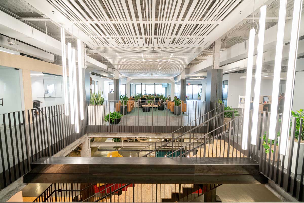
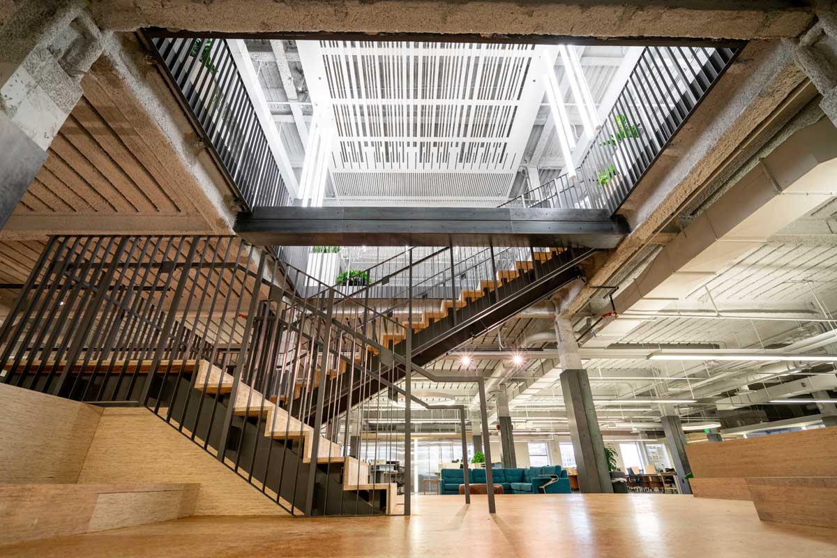
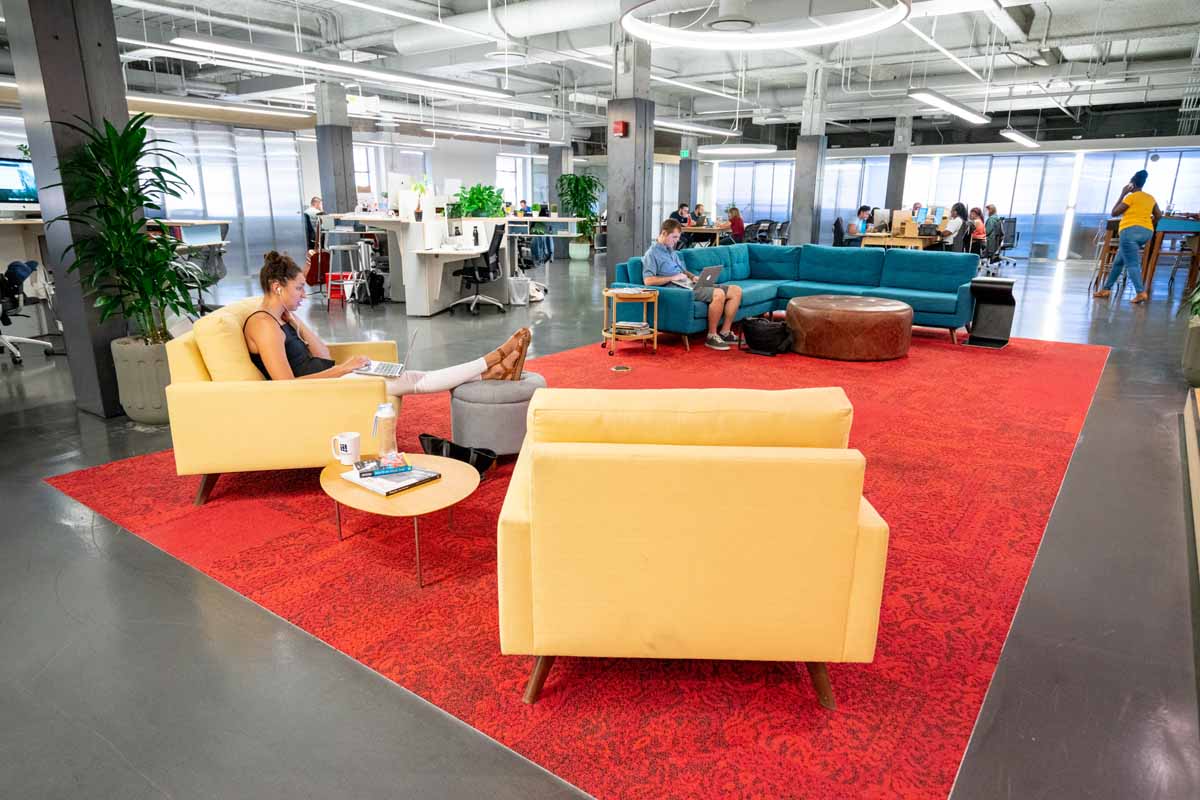
Architectural Photography
When you run a business that's built on a uniquely design interior space and an incredible geographic location, words alone do not suffice. The Department rebrand required professional photography to show off the incredible spaces that are such a large part of who they are.
A Brand Video
That speaks volumes
Photos are great and can be used in almost any application. But, with a space as grand as The Department, only video can really do it justice. With a clever script, some amazing local talent (their own community manager, Marissa), and a drone, we put this video together shortly after the Department rebrand.