AmPhil Rebrand
Naming - Logo Design - Verbal Guidelines - Visual Guidelines - Website Refresh - Video Production
Simplifying a deeply intellectual brand to streamline relationship building

Strengthening a Brand to Strengthen Society
A smart brand needs a smart branding agency.
Some brands work hard. Others quote Alexis de Tocqueville. When you find a brand that does both, you have something special. And that brings branding challenges. When American Philanthropic came to us with the task of rebranding and renaming their growing agency, we were excited to dive into a project of such depth.
Make it simple.
Great brands are able to simplify their depth—to make it understandable. AmPhil's brand had grown complex. This meant simplifying the brand name, the logo, the brand visuals, and the messaging. AmPhil had also embraced implicit brand truths that needed to be documented. We helped AmPhil discover and detail their brand values, personality traits, and brand anthem to give their team members the tools they needed to build strong client relationships.

AmPhil's rebrand is featured in the 2024 REBRAND 100® Global Awards
About the Organization
Too many consultancies offer advice, but leave execution to the client. But when AmPhil started in 2009, they wanted to change that by rolling up their sleeves and doing the hard work of helping their nonprofit clients execute the practical advice they offered.
Nonprofits love givers and doers.
Turns out, nonprofit organizations love working with people who can talk strategy AND do what they're proposing. So, AmPhil started seeing rapid growth. They began pursuing and forming relationships with some of North America's largest nonprofits and hiring the best talent to support them.
When you know it's time to rebrand.
As AmPhil grew, its bulky name and outdated logo became a hurdle. Enter Resound. On meeting the AmPhil team, we knew this was going to be a special long-term relationship. Soon after that, we were tasked with taking the highly intellectual and deep-thinking American Philanthropic leadership team through our branding process to define their brand identity, recommend a more streamlined brand name, and build an authentic visual identity to bind everything together.
A Hidden (Brand Name) Treasure
The new brand name was there all along.
Like looking for your sunglasses for an hour and then realizing they're sitting on top of your head, American Philanthropic's new brand name was there all along. Since the 21-letter, 8-syllable name didn't exactly roll off the tongue, clients and team members alike had been abbreviating the brand name to "AmPhil" for years. Our simple recommendation was: lean into it and formalize the informal.

And thus…
AmPhil
It was a naming decision that came with a huge sigh of relief from everyone in the organization. No more trying to type out the full name in client emails or pronouncing it with a mouthful of pasta salad when your aunt asks you about your job at the next family gathering. It was a branding decision that just made sense, and the rebrand process answered all of the questions they needed to know it was ok to make it official.
The Brand Foundation
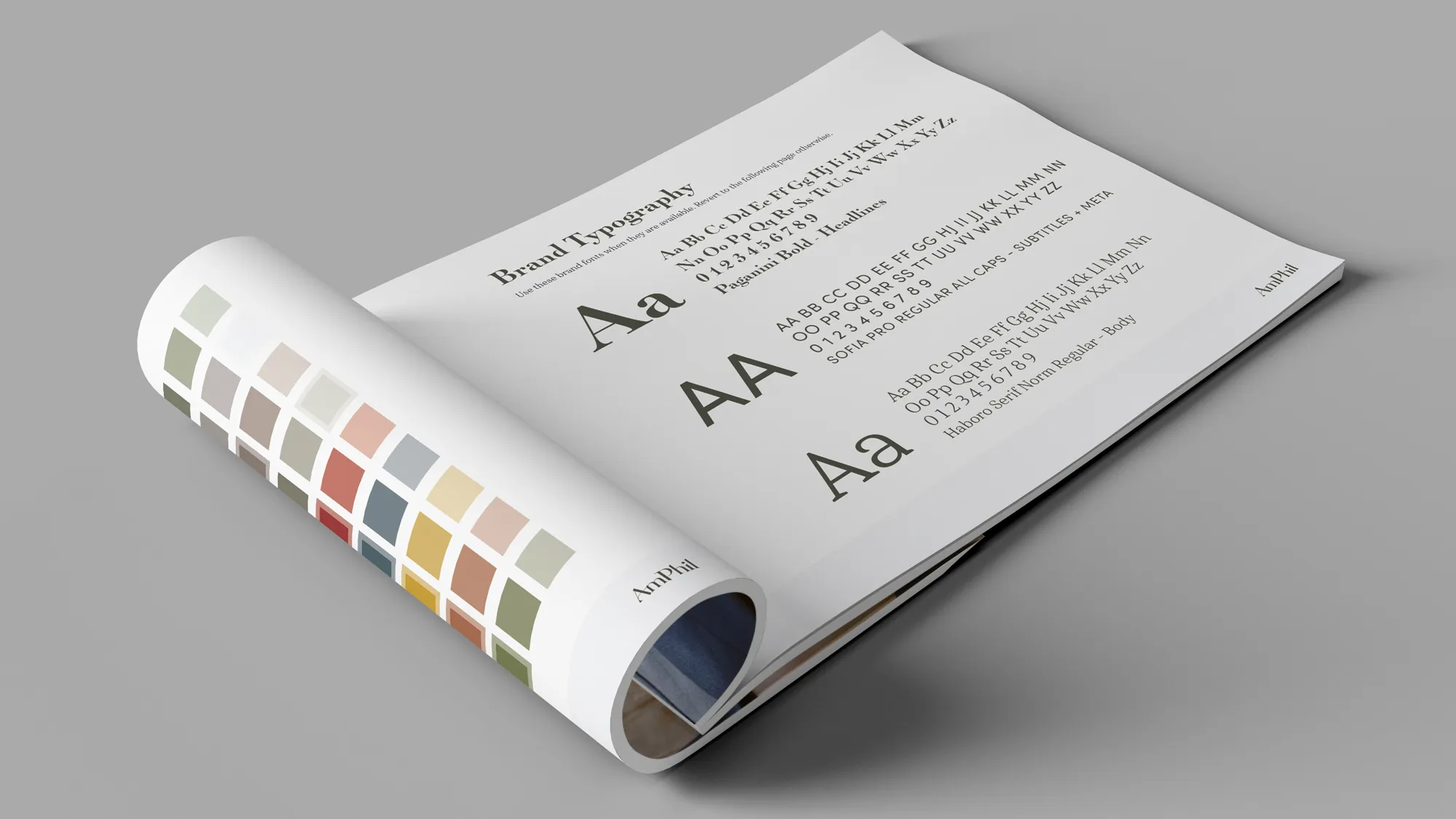
The rebrand centered around American Philanthropic’s core purpose and tagline: to strengthen civil society. Our job was to help them define, in the simplest terms, how and why they execute that purpose. We guided their leadership team through our award-winning brand identity process and discovered a set of foundational core values and unique personality traits. The brand finally came to life both for their internal team and longtime clients. From there we crafted their brand anthem—the story of who they are, what they do, and why they do it. This gave us the necessary brand foundation to build out the rest of their brand assets and rollout plan.

The Logo
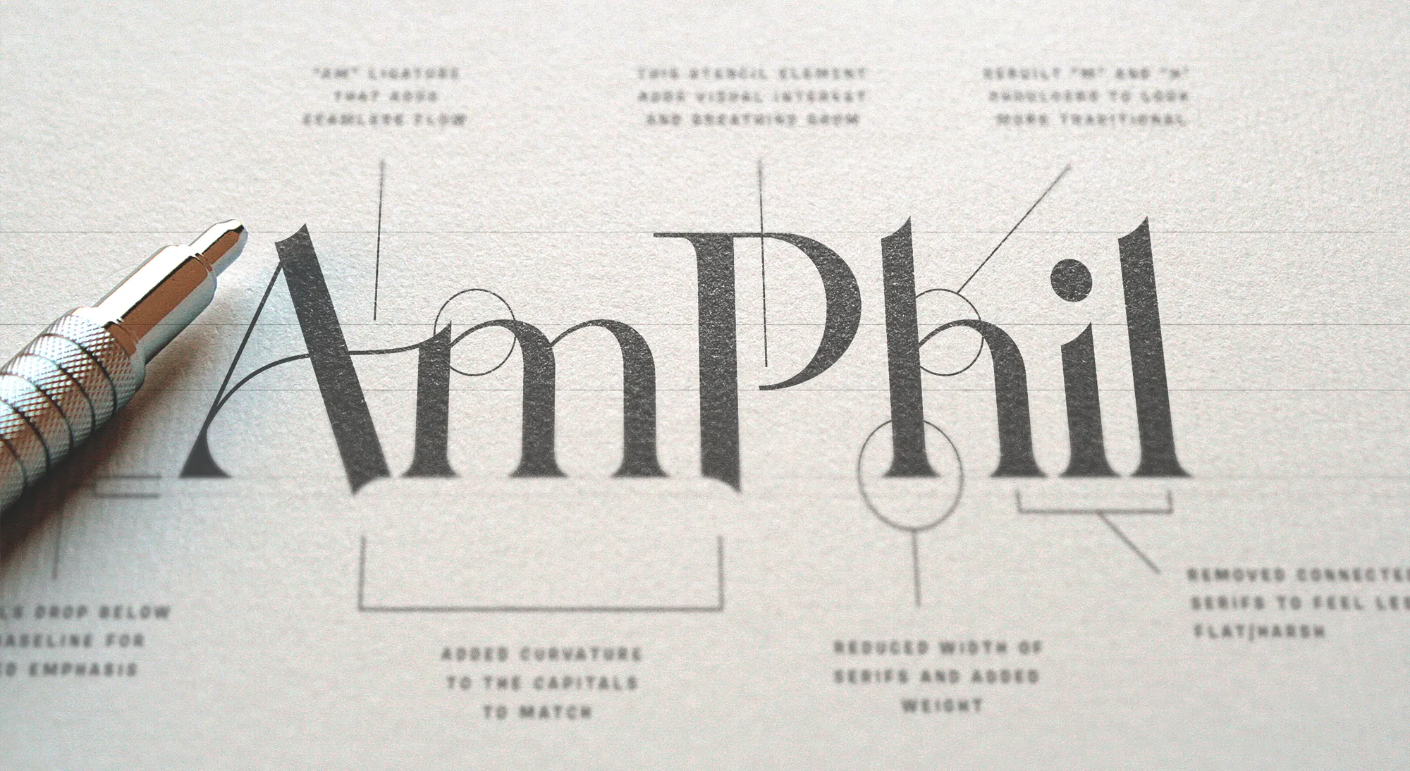
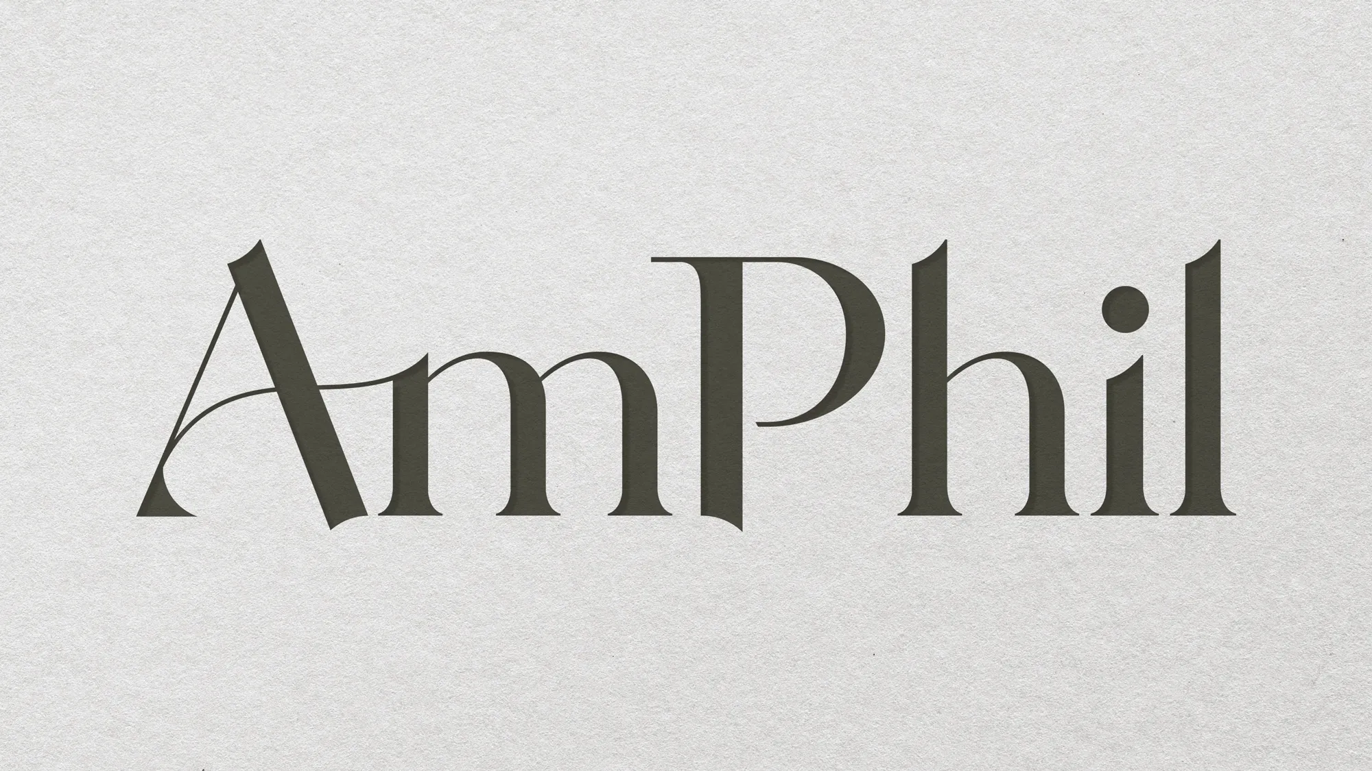
A custom word mark was the only way to capture this brand in a logo. It had to be simple, strong, classic, and sophisticated—all in one visual. What resulted was a beautiful and timeless logo that will serve AmPhil for decades to come.

The Texture
Remember the tree logo you saw at the top of this page? We couldn't let such a detailed piece of AmPhil's heritage just fall by the wayside. We decided to recycle the old logo into a subtle texture for use in digital and print design.
Roll it Out
The AmPhil rebrand was just the beginning. They had big plans that included redesigning their collateral, a brand anthem video and a website refresh. Resound was up to the task on all fronts.

Website Refresh
A new website brings a rebrand to life. AmPhil knew this and enlisted our help to take their new visual brand and make it come alive on their website.
Brand Anthem Video
We knew a sophisticated brand like AmPhil needed a platrform to talk. We produced this brand anthem video to let AmPhil's leaders show their commitment to the brand in their own words.

Award Winner
Resound won a Telly Award for this one. But really, we just pointed a few lights and cameras at the true experts at AmPhil. Our wins are always our clients' wins and we're thrilled this video got the recognition it deserved!
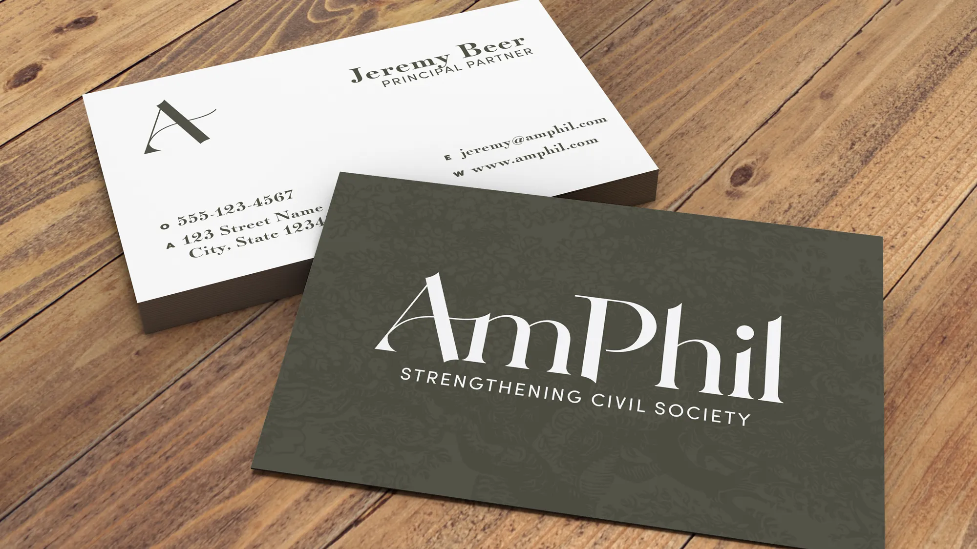
Collateral Design
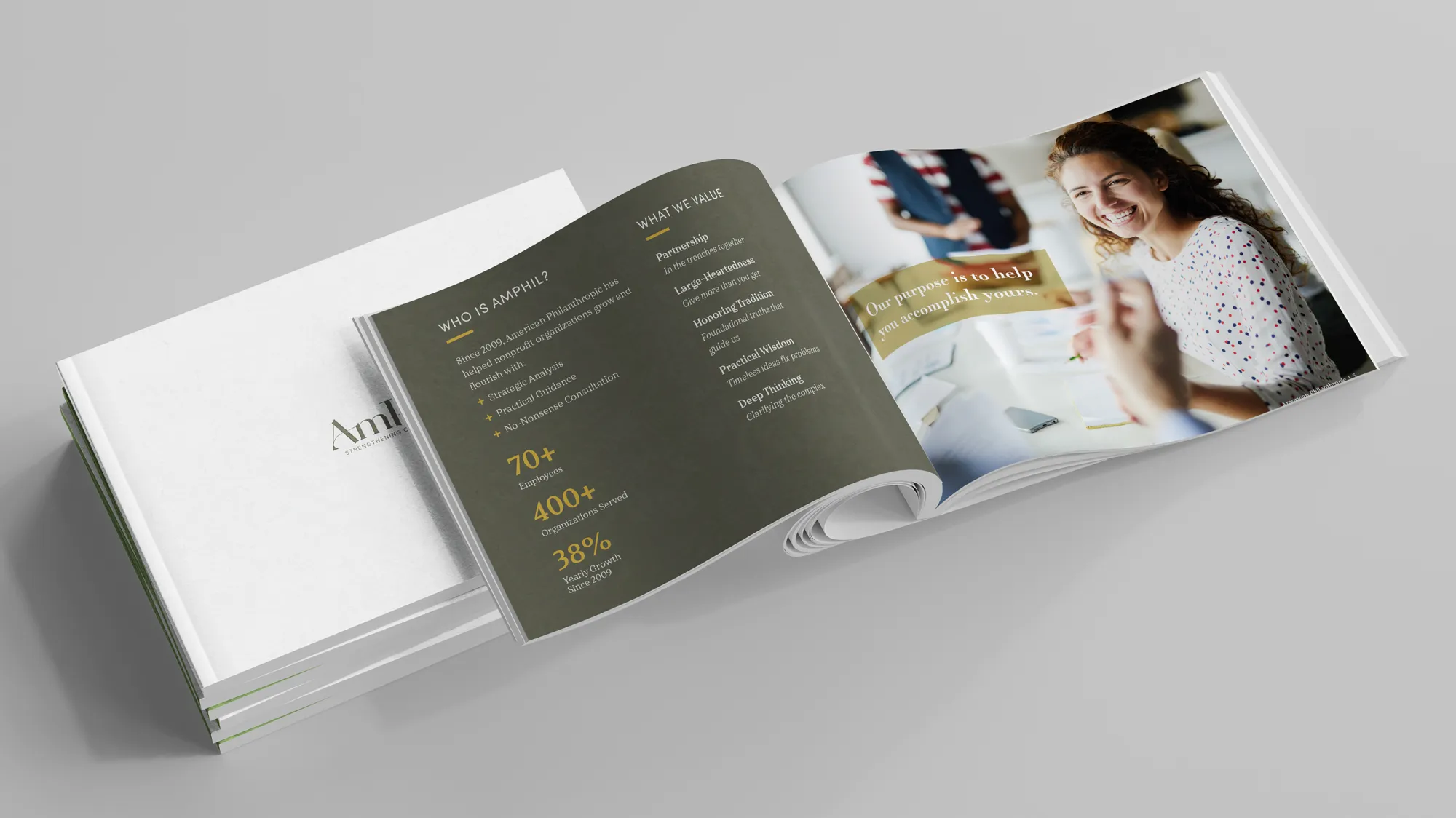
AmPhil's branded collateral projects its values and personality. They're not just dumping business cards at industry events or giving away cheap branded merch to clients. AmPhil's collateral bolsters their presentations and client outreach. Needless to say, this was one piece of the brand rollout that the organization couldn't wait to get their hands on.