Henry and Horne Wealth Management
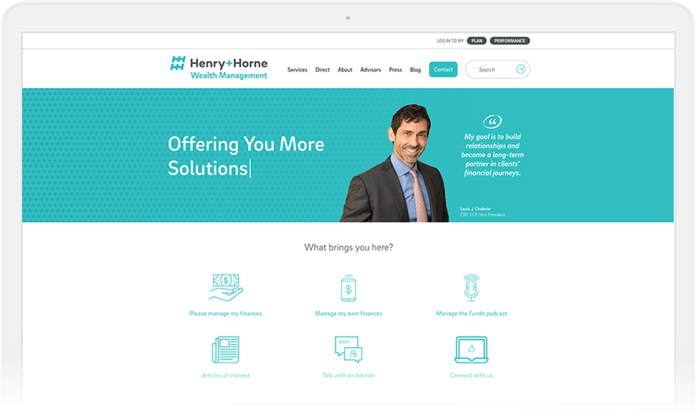
We work to align the Henry and Horne Wealth Management site with the parent brand while still giving it its own corner of the internet.
“Working with Resound on the firm rebrand was a great experience. They didn’t just want to give us a pretty logo, they wanted to understand the firm, industry and the perception the firm has with our clients, the community and our team members. Resound made the whole process, from the brand audit through the launch, run very smoothly. Their team is creative and professional. I am very excited with the final product we received from Resound."
Pulling a Partnership Together
Henry+Horne is a leading financial services company in Phoenix. Their comprehensive list of services is impressive, but like many companies, some of their specialized services are performed by highly-qualified and trusted partners outside the walls of Henry+Horne’s headquarters.
This was the situation when Henry+Horne asked us to help bring their wealth management partner’s website more closely in-line with Henry+Horne’s parent brand. The business relationship between the two parties was changing, and this meant that the wealth management partner’s consumer-facing image needed to merge with Henry+Horne’s newly-revamped brand.
The problem: the wealth management partner’s current website was about as far from being aligned with Henry+Horne’s brand as possible. The content wasn’t in the right voice, the design was miles apart from what we’d done with Henry+Horne’s main site, and even the domain didn’t make sense considering the close ties to Henry+Horne.

Wireframe Workshop
After getting the lay of the land from Henry+Horne’s Marketing Director, we conducted a collaborative wireframe session with the client’s team to generate a number of different ideas for the site’s overall structure. We also wanted to see if there was a consistent vision for how the wealth management website should tie into the main Henry+Horne site.
Thankfully, great minds thought alike!
More than one person in the wireframe session sketched out or talked about a way for design elements on the main Henry+Horne site to be slightly tweaked to work with the redesign of the wealth management site.
We knew that the current wealth management site needed its content refreshed to more closely align with the verbal guidelines we created for Henry+Horne when we did their rebrand.
Content Strategy
We knew that the current wealth management site needed its content refreshed to more closely align with the verbal guidelines we created for Henry+Horne when we did their rebrand. Thankfully, Henry+Horne’s copywriter (who had been on-board for the rebrand) was up for the challenge and already proficient at writing content with Henry+Horne’s rebranded personality traits, tone, mood, and voice. We provided design mockups for the various pages after the wireframe session and let Henry+Horne’s writer go to work!
And even then, we made all the content for the new wealth management site editable so the Henry+Horne team could directly manage and add to it in the future.
Web Design and Development
Given the shared vision for the look and feel of the new wealth management site uncovered during the wireframe session, the design mockups that came out of the wireframing went virtually untouched by the client. Buy-off on the design was almost immediate and kept the project on track.
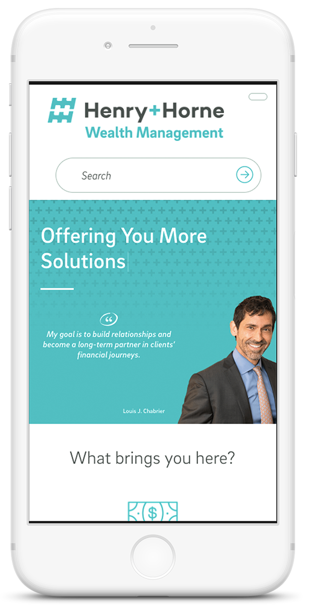
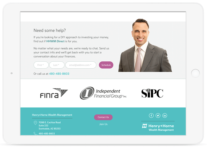
Visually, we brought complementing textures and colors to the design of the wealth management site while still keeping a structure that felt familiar to users who came to Henry+Horne’s main site first.
We wanted those users to feel like they were still within the “universe” of Henry+Horne’s web experience when they visited the wealth management site, but recognize that the wealth management side was like its own “galaxy.”


Like Henry+Horne’s main site, we tackled the design and technical complexity of adding random generation on the homepage. Making dynamic content line up correctly in a responsive environment isn’t easy, but we had to do it because it gave the wealth management more visual brand alignment with Henry+Horne’s website.
We also had to navigate the requirements of various regulatory bodies that oversee financial services institutions.
While much of this dealt with content, we had to build in interstitial pop ups to let users know they were navigating to a third-party site when they hit up the wealth management website through Herny+Horne’s main site. Compliance is king in this industry, so we played along (nicely) and made sure everything was in check.
Results
Unfortunately, there was no analytics reporting tied to the old site, so we set it up for the new one at launch. Even though before/after numbers didn’t exist, our Henry+Horne client received many compliments on the site. She loved the new brand alignment between Henry+Horne and the wealth management site, and she acknowledged that internal Henry+Horne employees now saw the wealth management arm as part of the larger Henry+Horne entity instead of a totally separate company.
The owner of the wealth management company was especially happy with the new website, too, and was initially skeptical about the need for a refreshed site.
