
Case Studies
Serving clients well.
Review some of the work we’ve done, problems we’ve solved, and brands we’ve helped develop in industries like professional and financial services, manufacturing, tech, software, and commercial real estate.
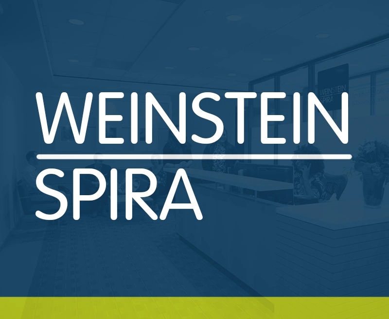
Weinstein Spira
A People-First Accounting Website
Web development, video production, consulting
Henry + Horne
Identity Crisis
Brand Strategy, Logo Design, Verbal & Visual Guidelines, Web Development
AmPhil
Simplify the Complex
Brand Strategy, Naming, Logo Design, Web Development, Video Production, Collateral Design

Sharefield
All in the Name
Naming, Logo Design, Verbal Guidelines, Visual Guidelines
United Dairymen of Arizona
Giving Excellence a Whole New Look
Brand development, website development, video, photo, collateral design, content strategy
Frain Industries
Communicating Remarkability
Web development, collateral design, video production, photography, content strategy
The Department
A Modern Business Dilemma
Brand strategy, logo, visual and verbal guidelines, video production, photography
MAC6
Scattered Brand Umbrella
Brand strategy, audience definition, webs development, video production, photography

TSI Supercool
Looking as Good as You Are
Web development, video production, brand and product photography.